Three entry points. None of them consistent.
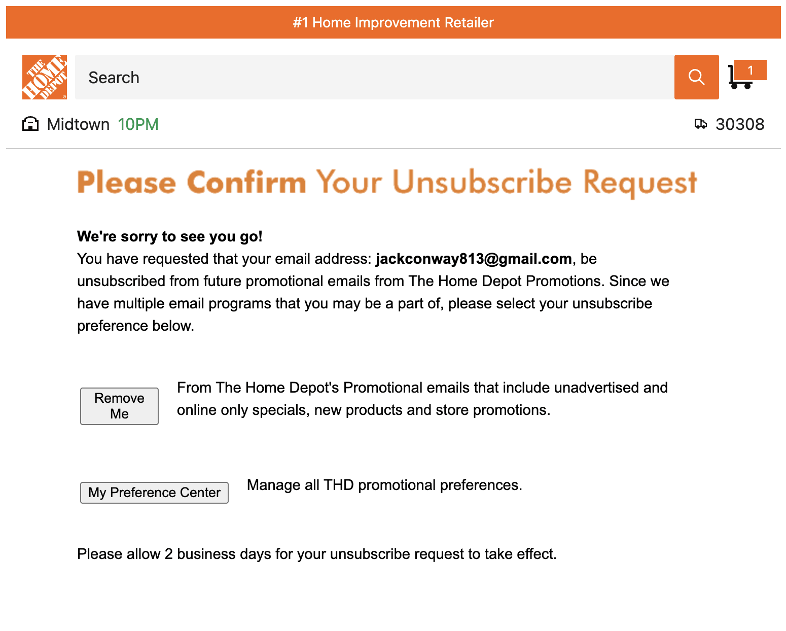
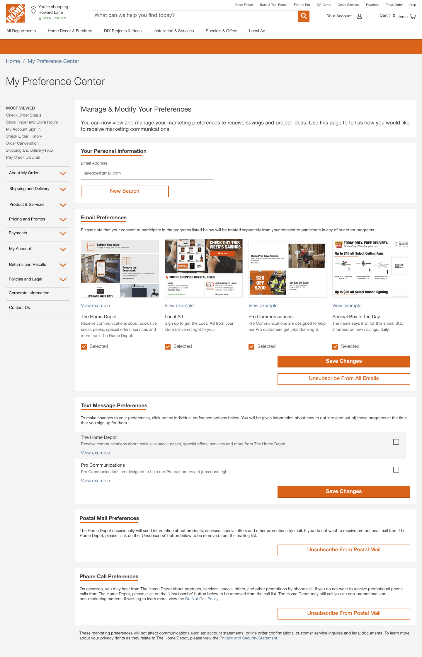
Customers had three ways to manage their preferences: a third-party landing page from email footers, an unauthenticated experience, and an authenticated one. Different UI, different patterns, different mental models. Most traffic went to the page we didn't own. Our own preference center was nearly impossible to find.
The third-party landing page was a technical constraint we couldn't fully resolve. What we could do was redesign the outdated experience we did own and make it worth finding.
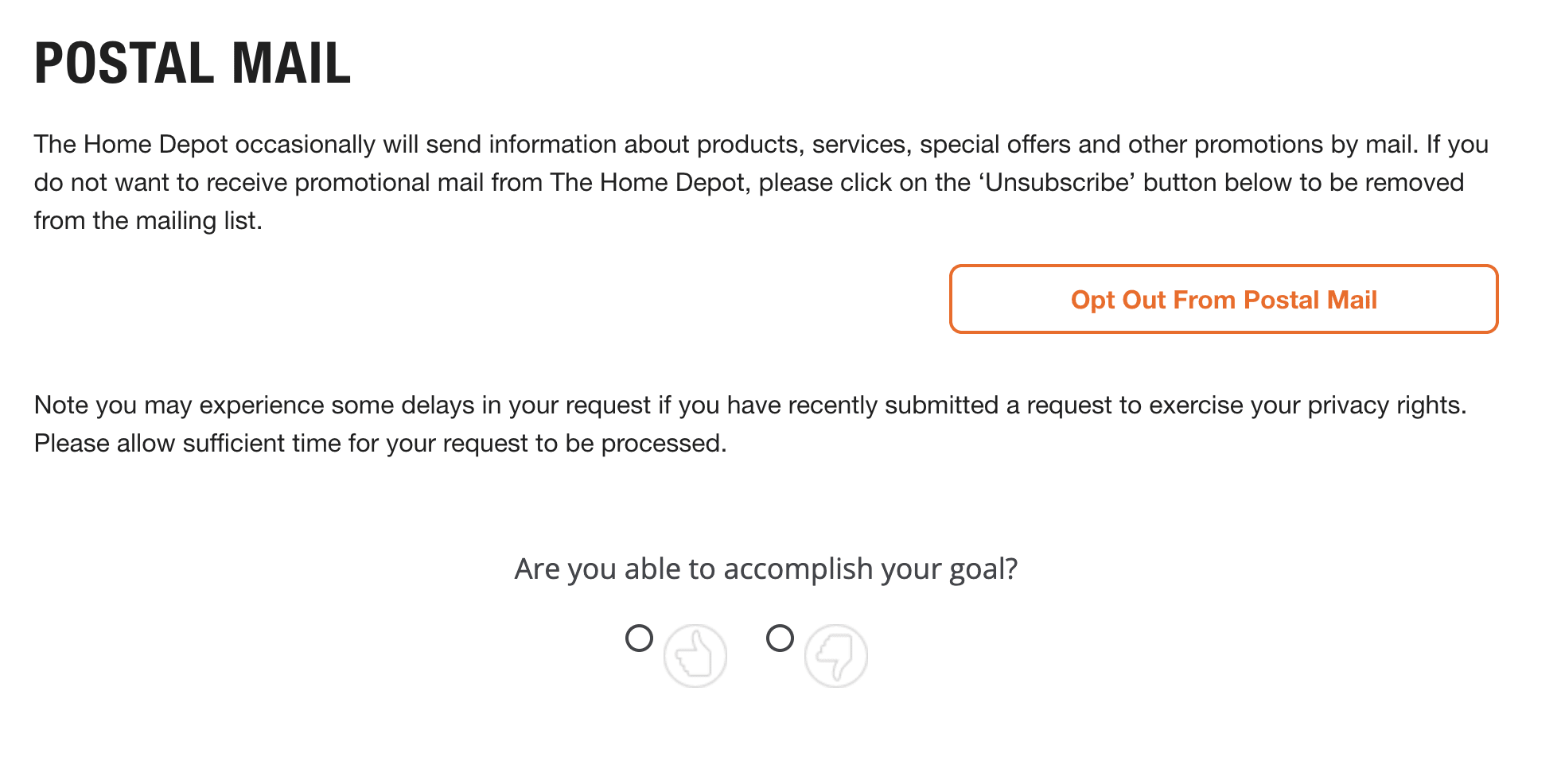
The bigger problem was the metric. We were measuring opt-out rate, which incentivized the team to make opting out harder. Before anything could improve, I needed to fix what success looked like.
The stakes were higher than a settings page. Research shows customers who trust a brand are significantly more likely to buy again and recommend it to others. I built an internal case for measuring trust directly, pulling from Deloitte, HBR, and industry data, and presented it to leadership. The preference center was the right place to start: it's where customers tell us what they want, and where we either honor that or don't.
Build the goal before the feature.
Fix the metric first
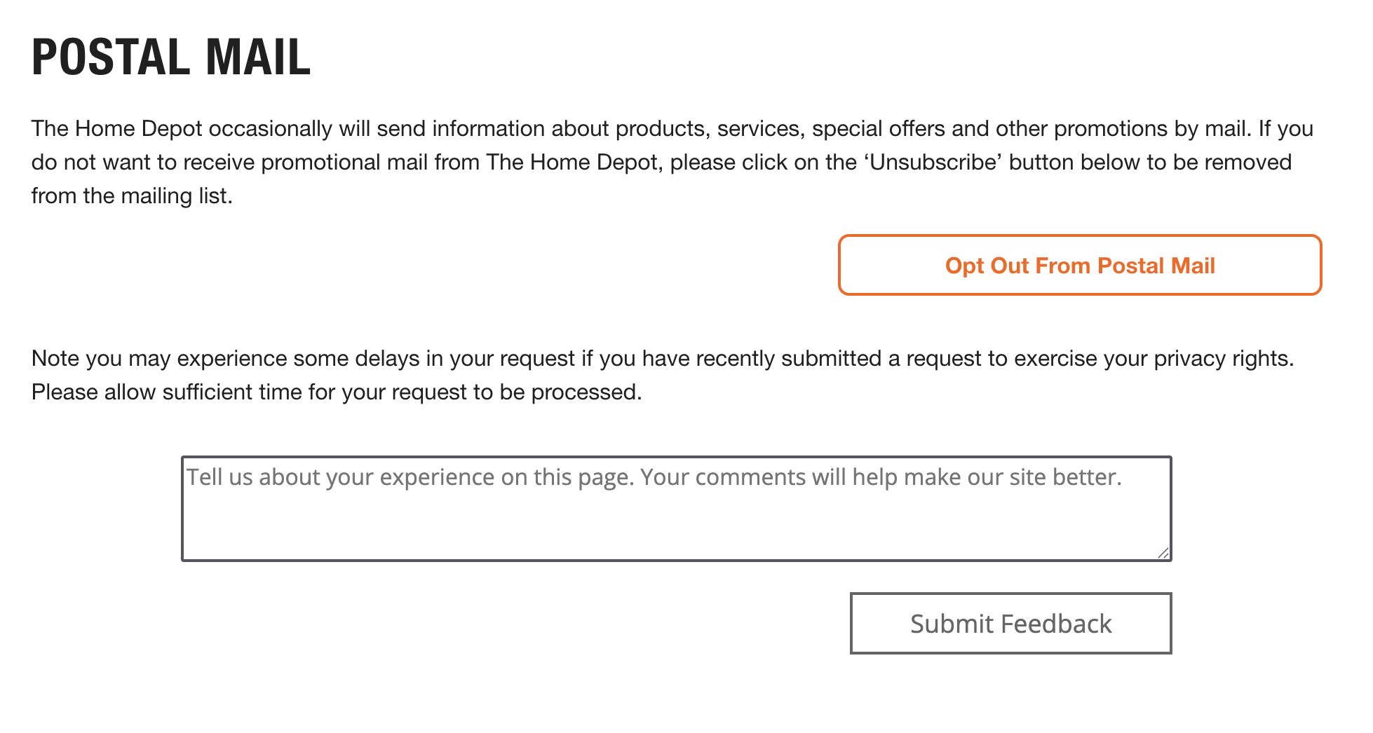
I replaced opt-out rate with a thumbs up / thumbs down satisfaction survey, low lift to ship, high signal. I noticed the search team running something similar via Qualtrics and adapted it. I also added unsubscribe reasons to capture why customers left, not just that they did. Together they gave us a complete feedback loop, and I showed the team the dashboard before asking for roadmap space. Product was immediately on board.
Satisfaction survey — replaced opt-out rate as the primary metric.
Qualitative follow-up — gave us categories to prioritize against.
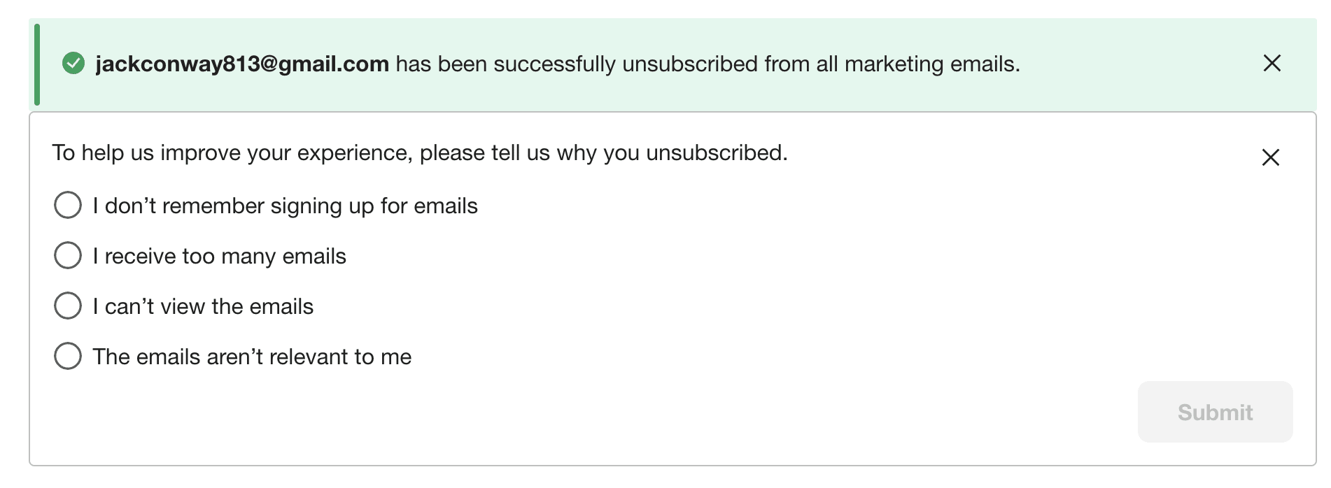
Unsubscribe reasons — closed the loop on why customers were opting out.
Turn data into a vision
The dashboard showed what customers wanted. I layered in competitive research and Pro customer interviews. A key insight: the person managing preferences wasn't the buyer. It was an admin setting communications up for their whole team.
"We want customers to tell us who they are. Not infer it. Not buy it from somewhere else. Ask them — and use it to give them something better."
This became the foundation for a zero-party data strategy: ask customers directly about trade, company size, language, and communication needs, and use that to give them a more relevant experience. The preference center wasn't a settings page. It was a trust surface.
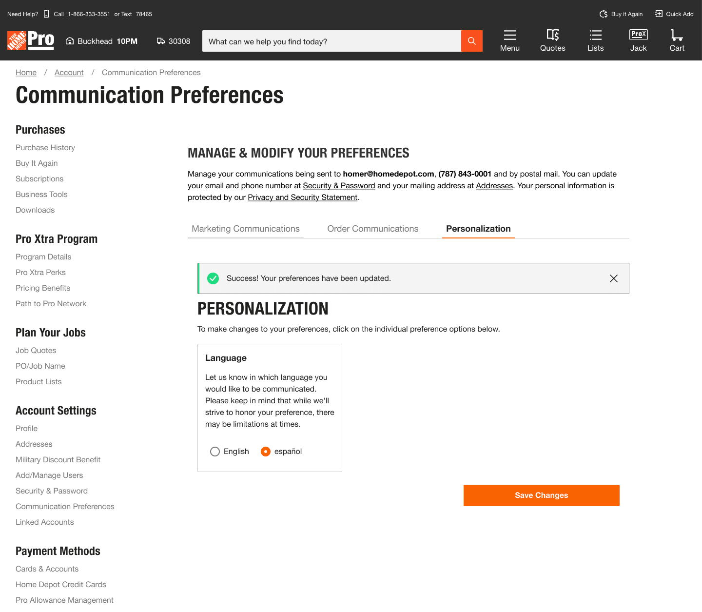
The redesign: Tailor Your Experience
A tabbed hub reorganized around intent rather than channel type, ordered by user value and business priority.
Tailor Your Experience — Future Vision


Getting alignment without authority.
Preference work doesn't move without buy-in from product, engineering, legal, and a half-dozen teams whose systems touch what customers actually experience. I started by getting product aligned on running discovery, then went wide.
- Interviewed stakeholders across store systems, delivery, personalization, communications, loyalty, and MyAccount to map what preference data existed and where the gaps were
- Aggregated findings with competitive research to build a case product could act on
- Brought a design back and pressure-tested feasibility with the design system owner and engineering before returning to product for alignment
- Validated with users before anything shipped
"The work that moved was work I could show data for. Once stakeholders saw the dashboard, the conversation shifted from 'why should we do this?' to 'how do we do this faster?'"
Legal & Privacy
Redesigning around a constraint.
My original "unsubscribe all" pattern blended marketing emails with required transactional messages. Legal flagged it as unshippable. Instead of taking their redlines and moving on, I pulled Legal, Privacy, and the PM into a working session. We walked the actual screens and API contracts together and came out with a split architecture: marketing fully controllable, order and account updates always-on but explained.
I rewrote the copy in plain language and validated it in testing. Participants could accurately describe what would and wouldn't be turned off. Legal signed off. The pattern shipped.
CRM & Downstream
Closing a trust gap no one could see.
Customers who opted out of a specific SMS program in EPC were still receiving those texts. The design was correct on our end: the toggle mapped cleanly to the subscription. The problem was downstream. I partnered with CRM and engineering to trace the full data path, documented the mismatch between what EPC stored and what the campaign tool was reading, and facilitated alignment on a shared taxonomy and single source of truth.
The complaints stopped. The feedback loop I'd built is what caught it.
Some shipped. All of it mattered.
Spanish language toggle — designed years ago, now a company-level rollout.
"I came in to take orders. After six months I realized I needed to find my own work, because I could move faster than the work was coming in."
What was mine.
As the only designer on this team, I had full ownership of the experience, from research and strategy through interaction design, copy, and stakeholder alignment.
- Research: Planned and ran all usability studies, customer interviews, and competitive analysis. Identifying the Pro admin as the real user reframed the entire product direction.
- Metrics: Identified the gap, designed the TUTD feedback system, built the dashboard, and socialized it with product before asking for anything in return.
- IA & interaction design: Mapped the three-surface architecture (unauthenticated, authenticated DIY, authenticated Pro), designed the information hierarchy for each, and defined the interaction patterns across all three.
- Copy: Wrote all microcopy and consent language, including the plain-language rewrites that came out of Legal working sessions.
- Strategy: Defined the zero-party data vision, built the trust framework, and pitched the Tailor Your Experience redesign to leadership based on CSAT data. Partnered with data science to quantify the Spanish language gap, surfacing 2.7M customers and $7.9B in spend as the business case.
- Cross-functional alignment: Ran discovery across six external stakeholder teams, facilitated Legal and CRM working sessions, and managed the downstream alignment that kept the product trustworthy end to end.