How can we increase buyer confidence for customers in Publix?
This project was proposed to us by our professor of User Experience Design. We were tasked with using technology to make traveling to the grocery store simpler. We chose our local Publix as the ideal location because we are their target demographic and it would be easy to perform user research in a short time frame. Additionally, their brand believes in putting customer service over everything, and this piece of technology would be doing just that.
Role: Researcher, Wire-framer
Role: Researcher, Wire-framer

Being tasked with "put technology in a grocery store" is a goal that needs to be narrowed down quite a bit. We identified the stakeholders in this problem and gathered information on both. Through 80+ surveys, 5 interviews, and hours of following our targeted personas around Publix, we had a solid foundation of data.
|
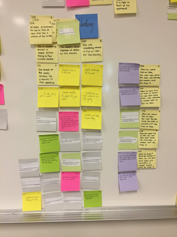
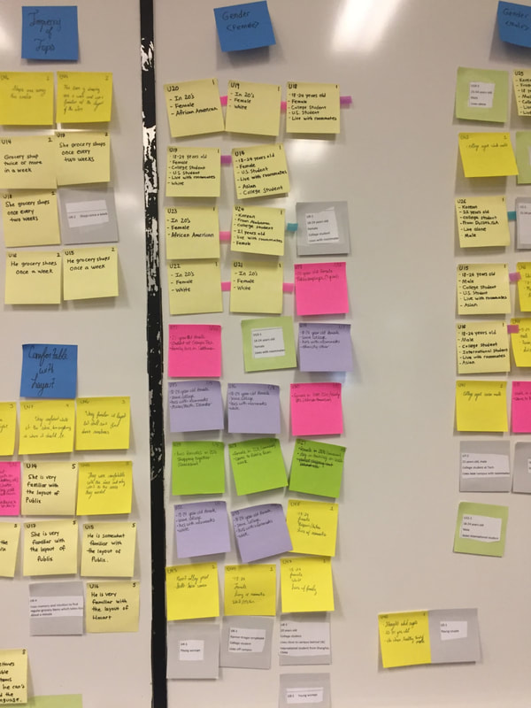
Like any good team of designers, we cramped our hands and beat up the environment by burning through a giant stack of post-it notes. Our affinity diagram highlighted a few main points we needed to address:
|
|
|
From this, we mocked up a few ideas to smooth out the customer experience.
|
|
|
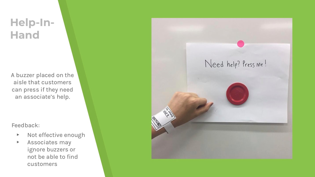
First, a wearable that would allow the associates to be notified when a customer is in need. This catered to Publix's ideology of customer service, but ultimately would be distracting and inefficient for the store worker.
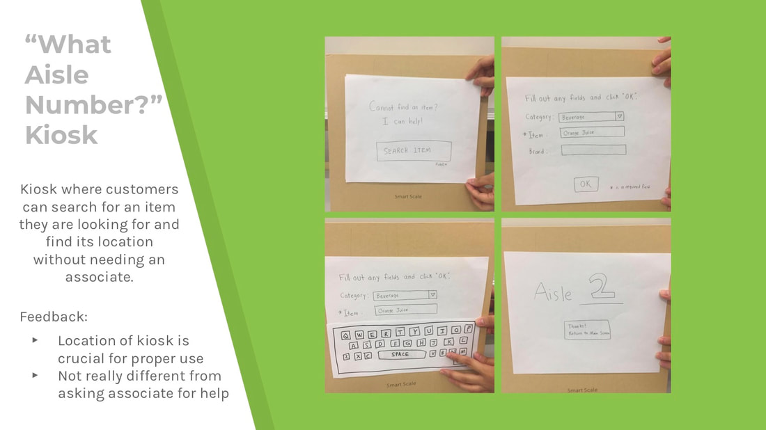
Next, a kiosk that would take input on a product and would direct a customer to a product. If implemented, it would take up too much space.
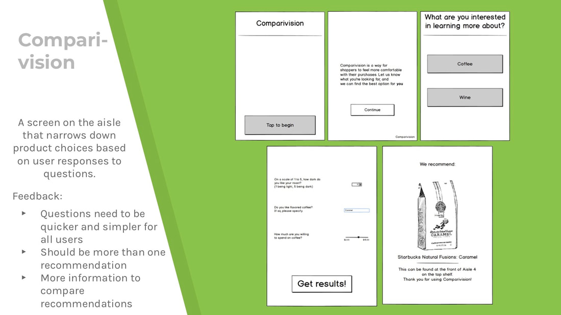
Lastly, our final prototype, "Comparivision." It is one kiosk that would be in the coffee aisle and would prompt users for a few data points that would guide the machine to give recommendations.
Next, a kiosk that would take input on a product and would direct a customer to a product. If implemented, it would take up too much space.
Lastly, our final prototype, "Comparivision." It is one kiosk that would be in the coffee aisle and would prompt users for a few data points that would guide the machine to give recommendations.

After settling on our final prototype, we determined a few heuristics to pay attention to and fix.
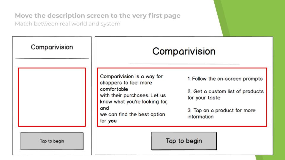
- Match between real world and system.
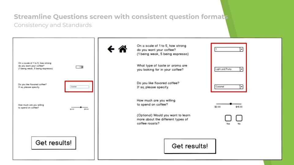
- Consistency and standards.
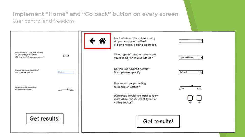
- User control and freedom.
|
|
|
|
See below for a prototype walkthrough on Balsamiq.
|
|