What is the easiest way to explain Hubspace with a landing page?
Hubspace is an ecosystem made up of smart products that can be controlled via a smartphone app or voice assistant. Our team was tasked with building a landing page to promote the value proposition and demonstrate setup. The value proposition given was the Hubspace app is a consistent, simple app experience. It acts as an on-ramp to all major smart home platforms.
Role: Designer
Role: Designer
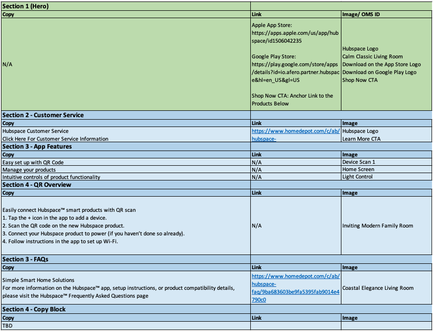
To start our projects, we are given information that needs to be included on the page in the form of a "matrix". Our partners who represent Hubspace hand over this document and leave the rest up to me and the copywriter. Over a week or two we take these links, images and copy suggestions and iron it all out into a design that we think represents the "ask" in the best way possible.
|
In this matrix, we were given direction on a hero image, a banner, a section to showcase the app features, how it works, and another FAQ section. The images were provided separately, although many did not work.
This was a very helpful jumping-off point, but left many of our questions unanswered. There is no video explaining what Hubspace is, or how to connect it to your smart devices. |
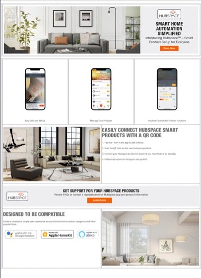
After tweaking some copy, we had built the page below. The videos we were hoping for were not ready for implementation yet, so I substituted with static images. I also included the Google, Apple and Alexa badges to show with what Hubspace works.
From this last iteration, we learned we needed to add a few more things to promote the value proposition of a "consistent, simple experience" and and demonstrating use cases.
The copywriter and I worked to find a place and format for the blurb, which was to sit right below the hero. We wanted to call out Hubspace's exclusivity with Home Depot in the hero, but it could not fit. The blurb mentions that and also gives the reader a brief explanation which makes the rest of the page more digestible.
Videos were a staple for this page. They weren't made available to us until the end, but it helped to replace the static images that were in place beforehand. Static images with no linking destination do not perform well.
- A blurb spelling out how easy the app is to use.
- Videos demonstrating how to connect your smart devices.
- Links to products that work with Hubspace.
The copywriter and I worked to find a place and format for the blurb, which was to sit right below the hero. We wanted to call out Hubspace's exclusivity with Home Depot in the hero, but it could not fit. The blurb mentions that and also gives the reader a brief explanation which makes the rest of the page more digestible.
Videos were a staple for this page. They weren't made available to us until the end, but it helped to replace the static images that were in place beforehand. Static images with no linking destination do not perform well.
Lastly, we added products to the Hubspace page. Originally, our content was going to sit on an automatically generated list of Hubspace products, but due to technical limitations we could not accomplish this. In our tight timeframe I had to rebuild the entire page on a separate platform. On this new platform we listed all of the Hubspace products that had launched, noting that there would be more to come. The goal here was to convert readers once they felt comfortable enough with the Hubspace products.


